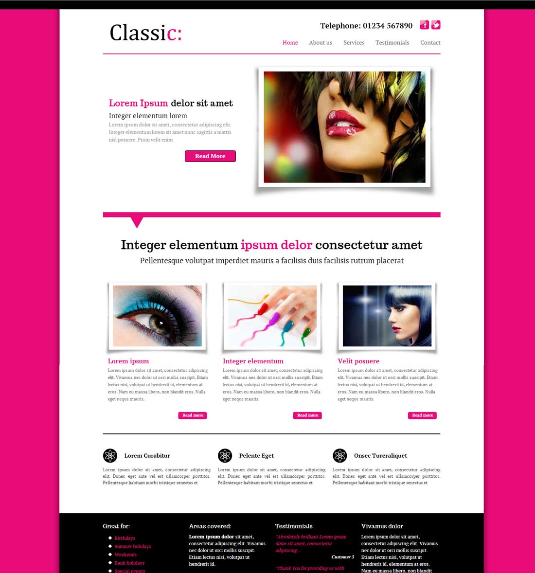
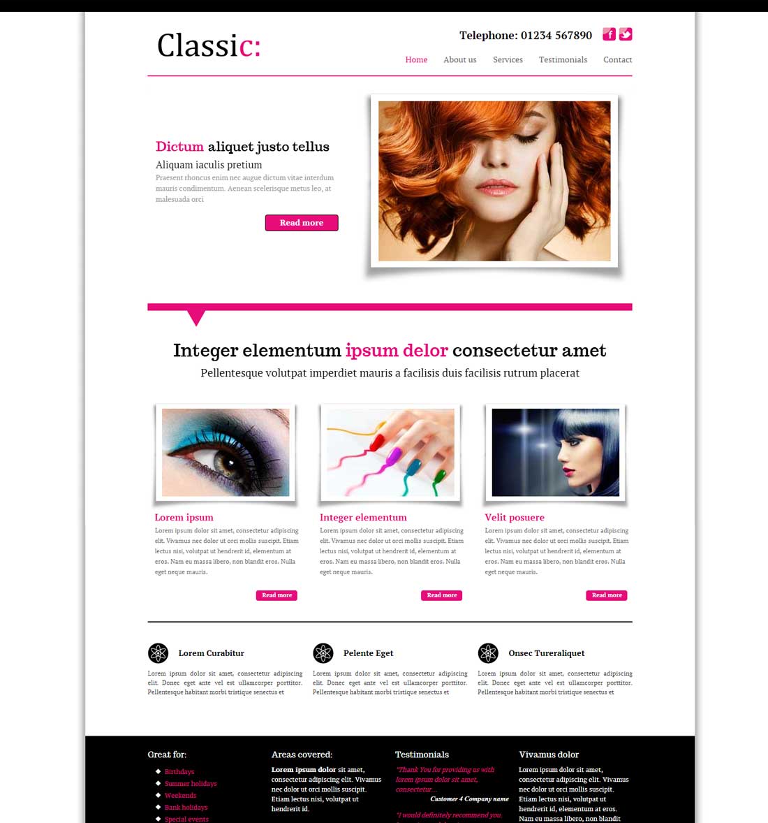
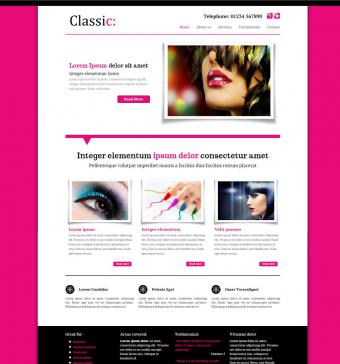 Classic is a modern yet timelessly elegant framework with either a classy white or contemporary coloured background.
The drop-shadow, photograph-style slider with striking mutli-coloured caption and custom fonts throughout will make your site really stand out from the crowd.
You can coordinate your site too by matching all the other colours - like fonts, links, menus and more.
'Classic' uses cutting-edge 'responsive' web design technology to resize itself to fit whatever device it is being viewed on- mobiles, ipad or PC.
As more and more people visit websites from smartphones, tablets and ipads, it is important to make sure your visitors have the best viewing experience possible.
'Classic' resizes itself to fit whatever screen it is being viewed on. No more faffing about making the site bigger with your thumb and forefinger.
Features:
- Any colour combination you like
- Dropdown menu turns into 'tappable' select menu for ipads and smartphones
- Slider turns from clickable to flickable on smartphones and ipads
- Adaptive images - automatically reduces the filesize of images to smaller devices.
- Resizes images and layout to fit
- Centred single column view on mobiles - repositions sidebar below main content
Dummy sites: Classic white or Classic coloured
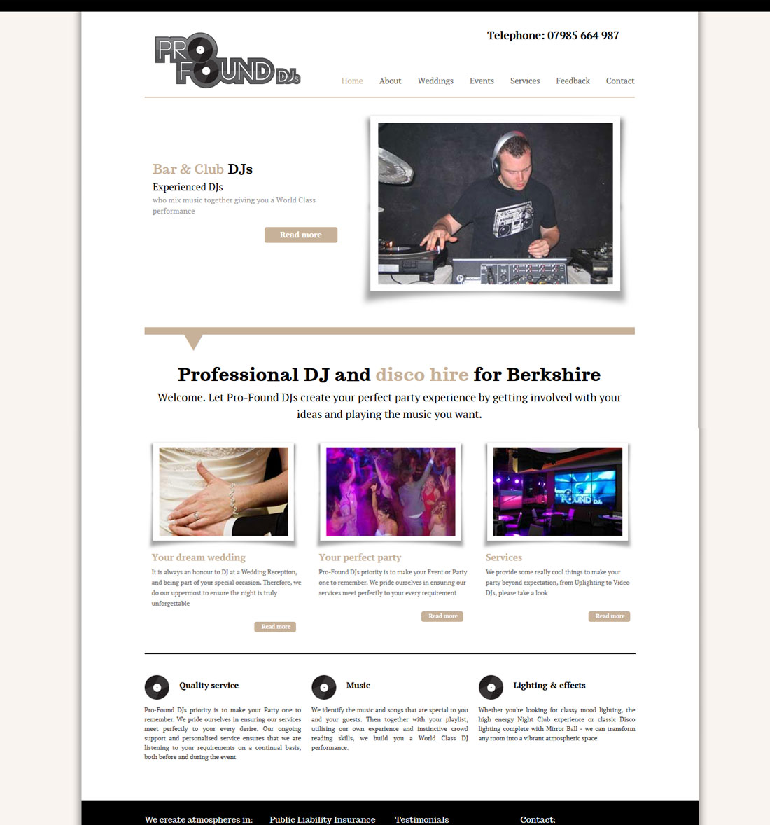
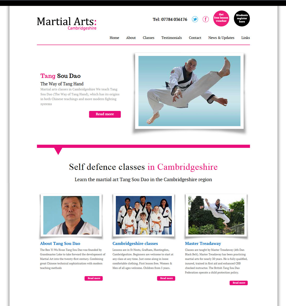
Example sites: Click images for a bigger view:
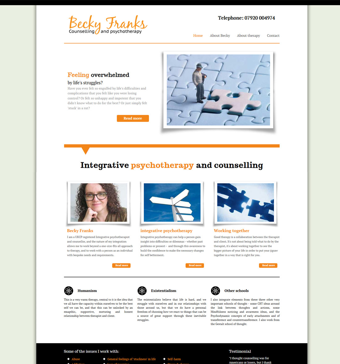
Some sites that use Classic: