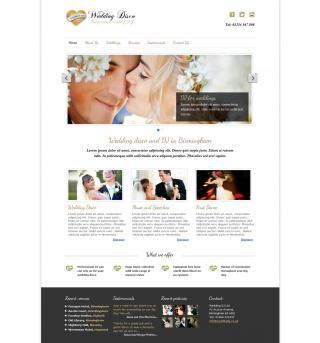 Responder is an elegant white framework that uses cutting-edge 'responsive' web design technology to resize itself to fit whatever device it is being viewed on- mobiles, ipad or PC.
As more and more people visit websites from smartphones, tablets and ipads, it is important to make sure your visitors have the best viewing experience possible.
Responder resizes itself to fit whatever screen it is being view on. No more faffing about making the site bigger with your thumb and forefinger.
Features:
* Dropdown menu turns into 'tappable' select menu for ipads and smartphones
* Slider turns from clickable to flickable on smartphones and ipads
* Adaptive images - automatically freduces the filesize of images to smaller devices.
* Resizes images and layout to fit
* Centred single column view on mobiles - repositions sidebar below main content
See what the new 'responsive' web design by Web Nation can do by viewing this short video
The soundtrack on the video is Midnight Shaker by the Bobby Blackston Band - you can find out more about them and/or buy their music here